 Menu 1
Introduction
We understand the importance of documentations. We also understand that documentations are tiring. So, we have tried to make our instructions as pleasing as possible and provide the best way to start off with your SASS HubSpot website template.
SASS is a multipurpose HubSpot website template pack created to provide highest visual and technical standards for webpages created with HubSpot CMS. Whether you are a developer, a designer, a marketer or an untrained person, our SASS template is basically a no-skills-required website generation tool for everybody.
Let’s create powerful websites!
Getting Started
First things first, here is what you get:
After purchasing our template pack, you will find all the templates in your HubSpot portal. The template-files are named with the prefix “SASS”. By searching for that term, you will find all the templates in your HubSpot design manager.
This pack contains all the necessary website and landing page templates in many variations, ready to build your well-designed, converting inbound website.
Visit our demo-page to check out all the pages and modules we created.
This documentation offers a basis to get started. In order to get a deeper understanding of the template this documentation also contains a reference guide for all the custom-coded SASS-modules. All possibilities of customization are documented here.
Important: To make sure that the SASS template is displayed and working correctly, please configure the settings under “Settings” → “Website” → “Pages” as follows:
If you have any questions, feel free to reach out to us any time and we will do our best to provide the answers you need.
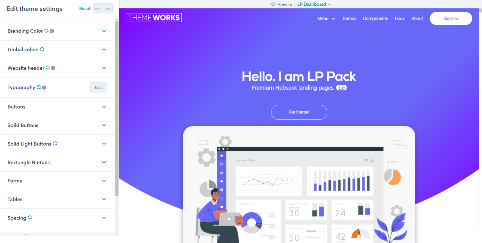
Edit your theme settings
A theme is a set of styles and templates you can apply to your website pages and blogs in HubSpot. To make sure that your website looks consistent, style settings for all pages using the same theme are managed in your theme settings.
You can easily customize your theme's settings by clicking the Design tab on the left panel in the page editor. Theme settings can be adjusted with intuitive controls such as toggles, switches, and color pickers.
Before you get started
Theme settings control the main colors, fonts, and button styles for pages using your theme templates. Edit theme settings To edit your theme settings, you'll first need to create a page with a theme template. The theme settings can be accessed within the page editor by clicking the Design tab on the left. Then click Edit theme settings.
Customizing colors, fonts, and spacing will set the default styles for all the elements on your page. If you want to edit specific details such as link colors, button colors, or default form colors, click Edit next to More settings to view additional theme settings available for your templates. Branding Colors Your theme's color settings apply a Branding, primary, secondary, and background color to all elements included in your theme templates. These styles will be applied to all elements on your website. To customize more specific settings for headings, fonts, and links, click Edit next to More settings.
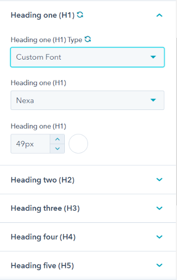
Fonts
Choose a Google and Custom font to apply to your website's headings, forms, buttons, and body text. All Google fonts are supported. Click the color bubble to customize your primary or secondary font colors. You can choose a simple color value or click the Advanced tab and choose a specific hexadecimal value with a color picker.
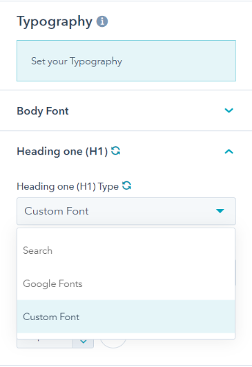
- Headings: you can customize the exact font, color, size, and style for any headings included on your theme. Body: customize the font, color, or text size of the body of your page only.
- Links: customize the default color of links on your website. You can also customize the color and behavior of links when a visitor hovers over or clicks your link.
- Custom Fonts: Once you upload the fonts in file manager, Copy the file path and paste in themeoverrides.css file under fonts. You will find the @font-face maker under which paste the file path.

Spacing
Your theme settings for spacing control the maximum width of your page content, and the vertical spacing in between different elements on your page.
Buttons
You can set custom colors, fonts, and styles for buttons on your pages and blog. Within the page editor for a specific page, you may be able to swap button sizes or types. Note that you can also find the button style choose option in each modules
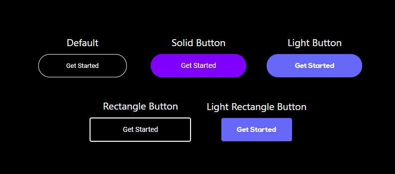
- Size: specify the dimensions of small, regular, and large buttons on your page.
- Solid Light Buttons: a primary button is for the most important action a visitor takes on your page. This color should stand out and catch your visitor's attention.
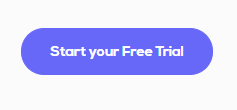
- Solid Buttons: a secondary button is used for relatively less important actions when there's already one primary button on your page. Secondary buttons are typically applied to pages for lower priority actions.

- Button: these are the default fonts and styles applied to simple button modules in your page.
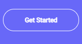
- Rectangle Buttons: it has Rectangle Shape with specific styling options .

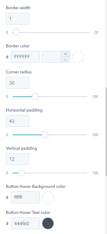
Each of the Buttons contain all several more editing option for hover color etc.
Forms
Customize the default colors, fonts, and text styles, and buttons styles for your forms.
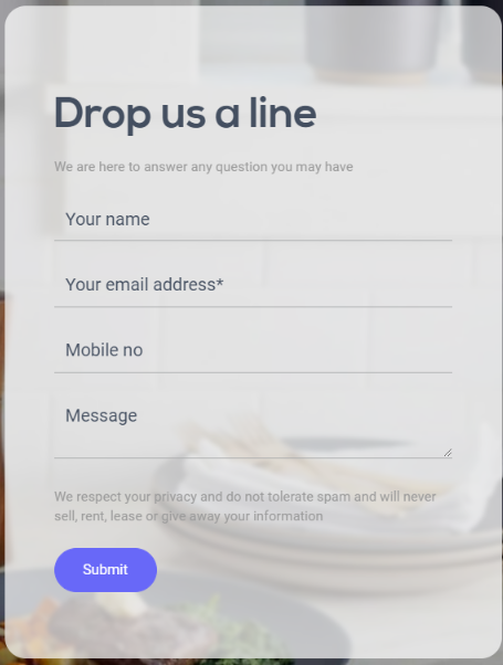
- Title: these are styles applied to the text field that appears above your entire form. This typically includes a greeting and instructions for completing the form. These styles on your form can only be managed here in your theme's settings.
- Labels: styles applied to the labels that appear above a form field.
- Place-Holder: styles applied to the Place-holder that appear in a form field.
- Fields: styles applied to the names of the form fields themselves.
- Help text: this is the sample content that appears inside each form field, indicating what type of information your visitor should submit.
- Border: the border color around the form fields.

Tables
Set the default colors, fonts, spacing, and borders for tables added to your page.
- Table head: the colors applied to fonts in your table header, and the default background color across the full width of the first row of your table. You can also set a bottom border for an accent color along the bottom of edge of your table header.
- Font color: default color for fonts in your table.
- Background color: default background color for the background of your table's cells.
- Border: the default border color, width, and style of your table.
Website header
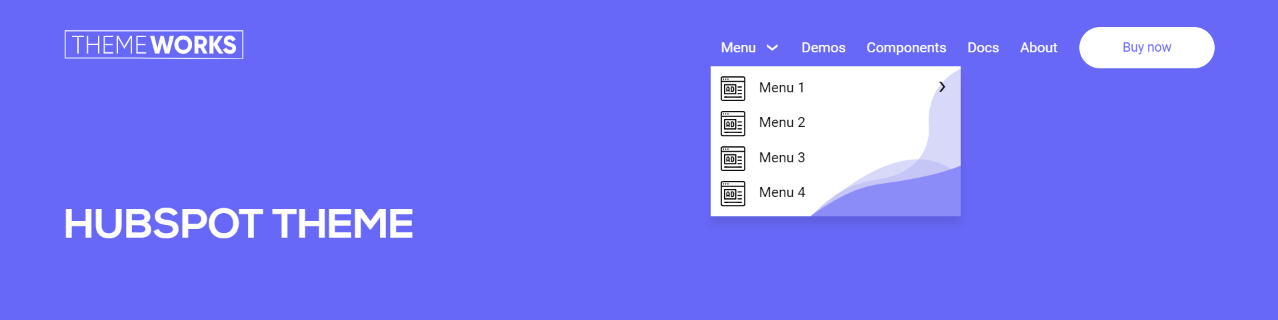
These settings control the colors and fonts that appear in your page header, including your navigation menu.
- Header Fixed/Not-Fixed: this field helps to make page Header Sticky or Non-Sticky.

- Menu: select the color and style of the font for your navigation menu when visitors view, hover over, or click a menu item. These styles can only be managed here in your theme settings.
- Background color: select the color for the background of the header of your website.
- Bottom border: if desired, you can add a horizontal line as a border underneath your website header. Select a style to activate the bottom border, then select a color and width for your border.
- Menu link color: it desired the color for parent Menu text for each list of child elements.
- Child menu link color: it desired the color for the child element in a list.
- Child menu background color: it desired the background color for the child element in a list.

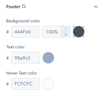
Footer
These settings control the colors and fonts that appear in your page footer, including any navigation menus.
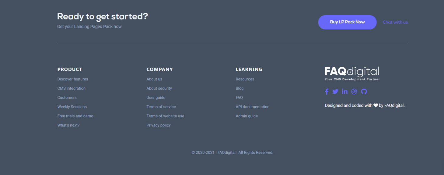
- Background color: select the color for the background of the footer of your website.
- Text color: select the color for the menu of the footer of your website.
- Hover Text color: it will be applied whenever menu of the footer is hovered
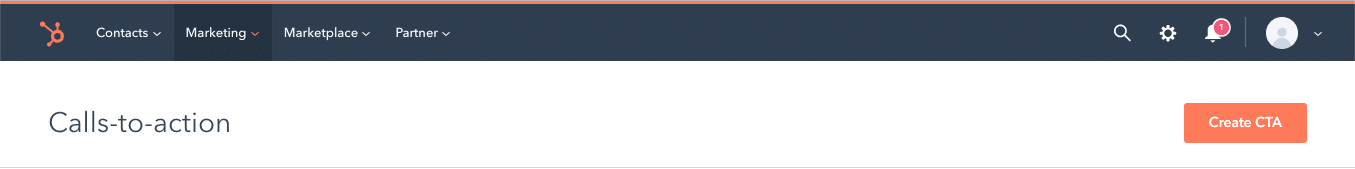
CTAS
In HubSpot CTAs are created using the CTA-Editor. To navigate to the CTA-Editor go to “Marketing” → “Lead Capture” → “CTAs”.In order to create a new CTA click on „Create CTA“.
Once you have configured the button content and link, make sure to select „Link (no style)“ in the Button Style option. All CTA-styles are handled and changed directly in the Template modules.
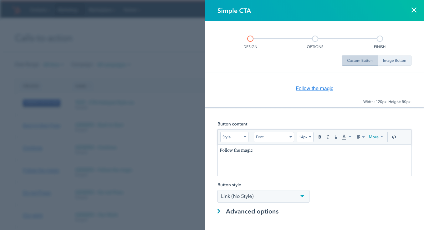
After configuring the options and saving the CTA, it is ready to be used in the template.
HubSpot CTAS in Modules
If the module supports the usage of CTAs you will find a CTA selector in the module configurations:
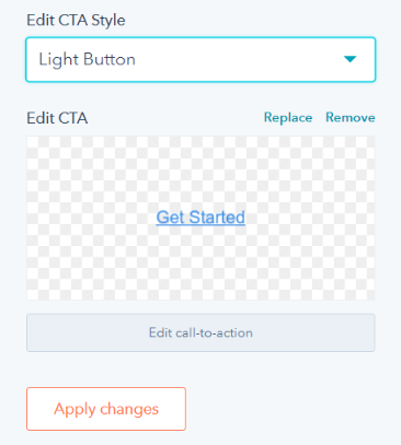
In the edit section of the module configurations, you will find different options to adapt the appearance of the CTA button.
Custom Modules
Blog Rss
- Edit Blog Feed: it allows you to choose different types of blog feeds available.
- Edit How Many Blog to Show: it allows you to control how many blog to show
Hero Section
- Edit Hero Section: you can edit this section in a very simple way.
- Background Color: Add the background color by the color hex code or use HubSpot’s color picker. Additionally the opacity of the background color can be configured.
- Background image: Add a background image through HubSpot’s image picker.
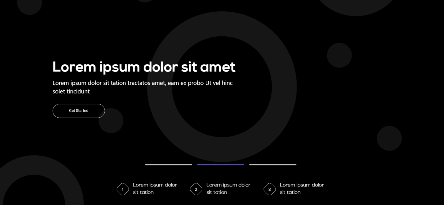
Types of Hero Section
- Simple Hero.
- One Column and Two Column Hero.
- Hero With Background Video.
- Hero with Slider.
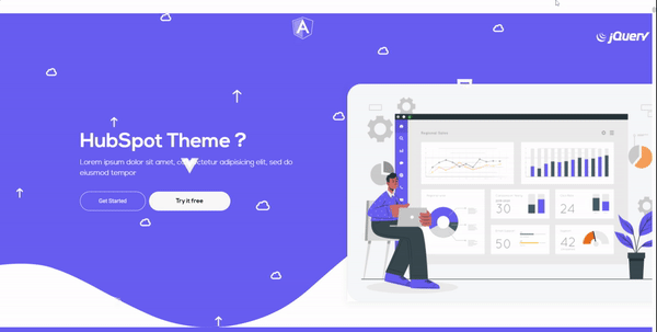
- Edit Simple Hero: In this simple hero with only one image in center you can change the image form HubSpot Image Picker.
- Edit One Column and Two Column Hero: In this two column section you can add one side of this module title, summary and one CTA. and on the other side of this module you can add one image from the form HubSpot Image Picker.
- Edit Hero With Background Video: In this module you can add the video for background form the And also you can add the video url in the HubSpot url field.

- Edit Hero With Slider: In this module you can add the multiple images and contents for the hero slider.
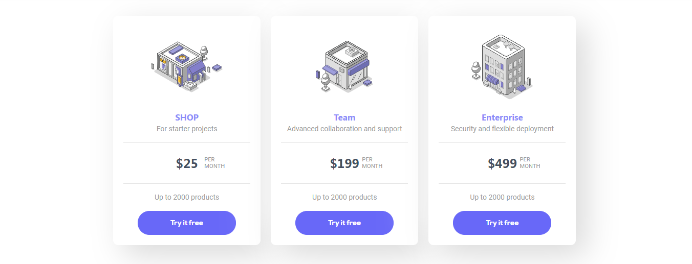
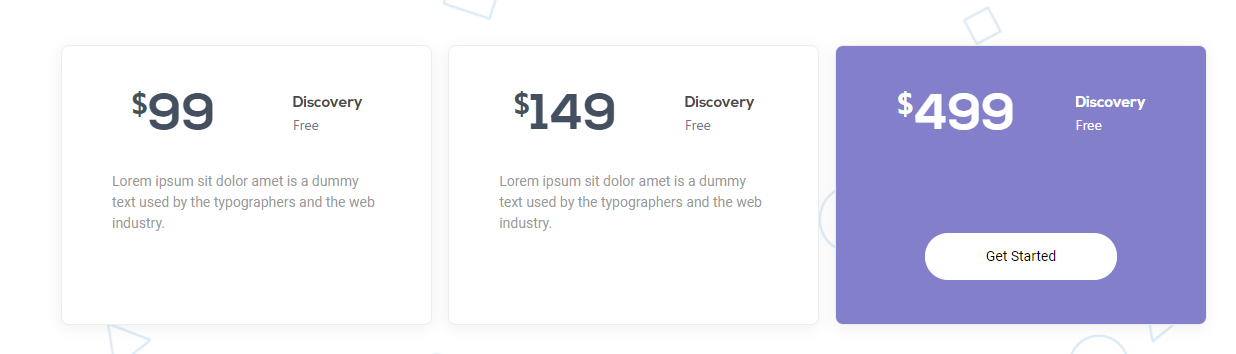
Pricing Table:
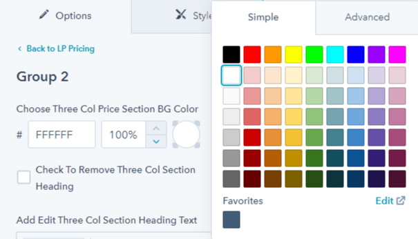
The LP Theme offers a pricing table module. This can display upto 4 Pricing blocks in one row.- Section Background color: You can choose the background color from the color picker and also you can write the hex code.
- Edit Pricing module: In this module there are three types of pricing card with three different style
- Select Pricing Module:In this module you can select the three different types of Pricing module with the help of boolean option

- Heading + Short Summary: This is the intro part for each module. you can hide and block this section heading and short summary with the help of boolean option. And also you can change the text color.
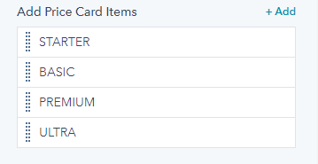
- Pricing Card Blocks Title and Icon/Image: This is the intro part of each card box.
- Price: The main price of each pricing Card box. Numbers and Text are possible.
- Feature: Each parameter set represents a feature. It is editable.
Pricing Card Feature
- Add One Hubspot CTA: in this card blocks you can add in hubspot cta.
Pricing Layout 1

Pricing Layout 2
Pricing Layout 3
Services
We are providing a editable services columns section.

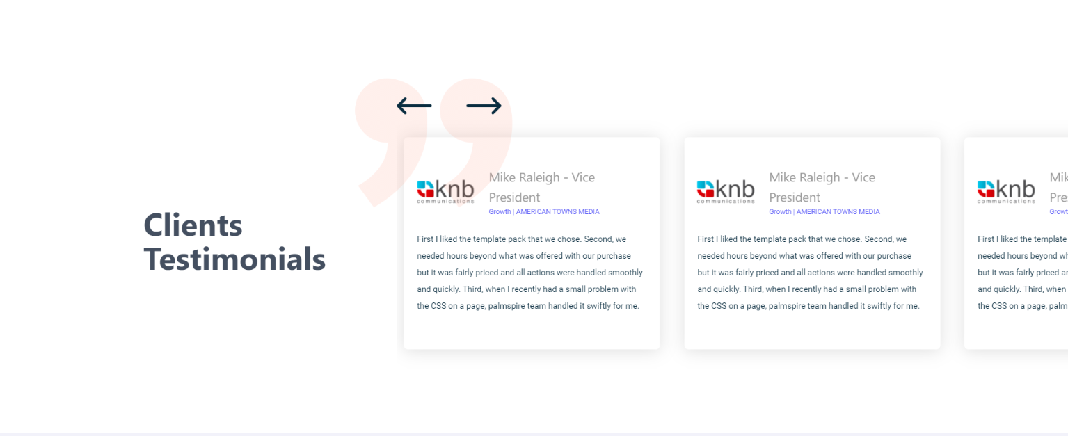
Testimonial
We provide a vast range of testimonail slider's with most editable options.

- Vertical Slider:This module is included with the client logo module. You can check to turn ON or OFF across pages by drag and Drop.
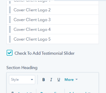
- Horizontal slider:these slider sections are capable of adding 'n' number of cards usinsg add option.

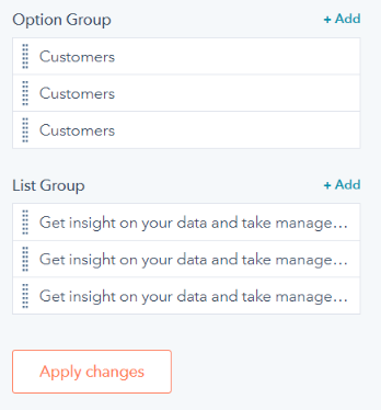
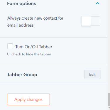
Tabber
Tabber modules are helpful in displaying a property or nature of the products in a better way. Modules does not required any of the scripting or adding a unique class to each of the options.

- Options Group:it is allows to provide the category, can include more and more by add option.
- List Group:this field will take two colum section content's either a image or gifs or text.
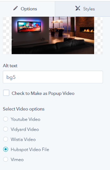
Video
video module can be made as popup video or a simple video player.
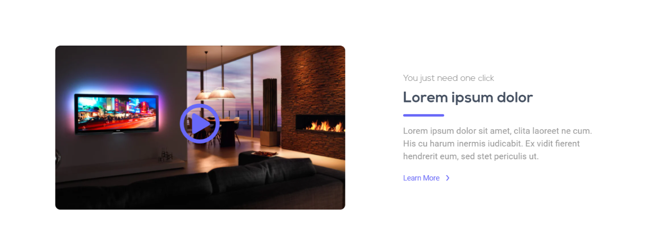
- Check to make as Popup:by enabling it you can make the video as a popup video.
- Select Video Options:this options will allow to add more video like youtube video, vidyard video, wistia video and also HubSpot video.
Background Color & Images
Every Module is provide with change of background color or images, it can be helpfull for pages.
- Background Color:
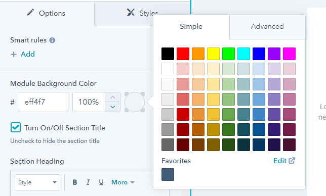
- Background Image:

Grids and Column
Modules are made column Changable by options provide in it
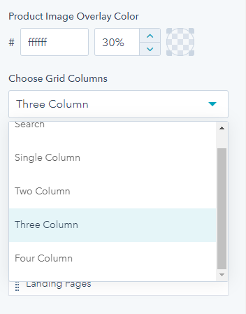
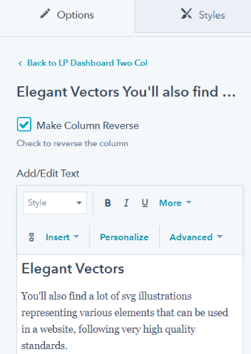
Two column

- Make Column Reverse:this boolean option will enable to make the column direction in opposite.
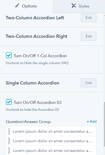
Faq
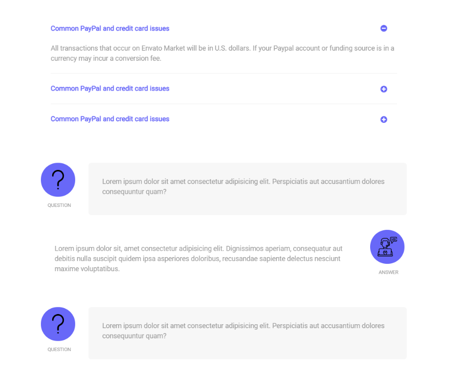
- Turn ON/OFF Accordion:it make the faq module includes different type like single column, two column and also with image.
Forms
Form modules can be made more customizable. By using the options provide in the modules with boolean option, editable fields for each and individual content.
- Form Customizable:boolean options can be included to make the form with tabber option or a normal form.
- Usage of forms:It can be used across the page with easily turn on or off options.


Global Edits
Header and Footer a editable under global content editor options. This includes section of menu items, branding logo, links and more.
Header
Branding Logo, Link and child menu Background Image
Image Edit Options

Logo can be Changed for both fixed and Sticky Header
Logo-1
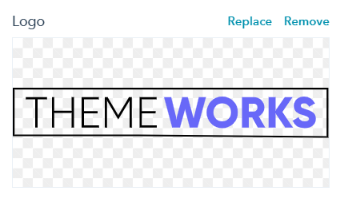
Logo-2
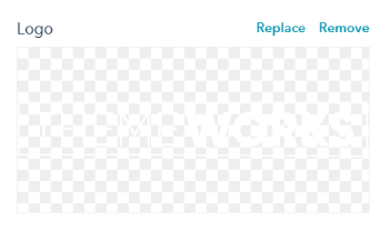
Footer
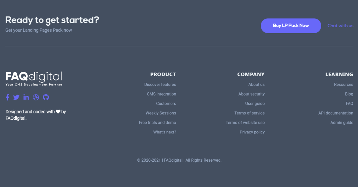
- Make Footer Reverse:by enabling footer column can be reversed
- Turn On / Off Top Section:it can be turn off to remove the top section
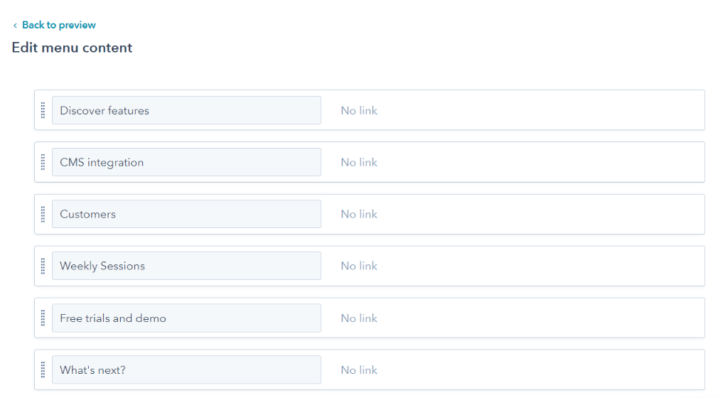
Footer menu are more editiable as header navigation menu. Can be linked using the page name or link or without link may be future relases.
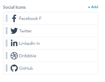
Social Icons
Each social media icons is editable and linked to the respective pages.
SUPPORT
If you have any further questions regarding the templates, customizing the templates and other website/email services, we’d be happy to help you any time.